Utility companies face a lot of interesting challenges that spill over into the way you advertise for them. A hike in gas charges and you have to ease up on the humor. Too serious and you frighten customers. We walked the tight rope with our client every step of the way and even opened a line of communication with one campaign that allowed customers to have a direct conversation with the CEO.
Branding
The original Citizens Gas logo, created in the 1960s, was beginning to feel dated. When the company expanded to include additional utility services, it needed a fresh name and modern identity to reflect a progressive, eco-friendly direction. The new “C” logo mark symbolizes a cross-section of a pipeline—representing the core method through which most of their energy resources are delivered. The updated color palette reinforces their renewed commitment to environmental responsibility while maintaining a clear connection to their natural gas heritage.


Here
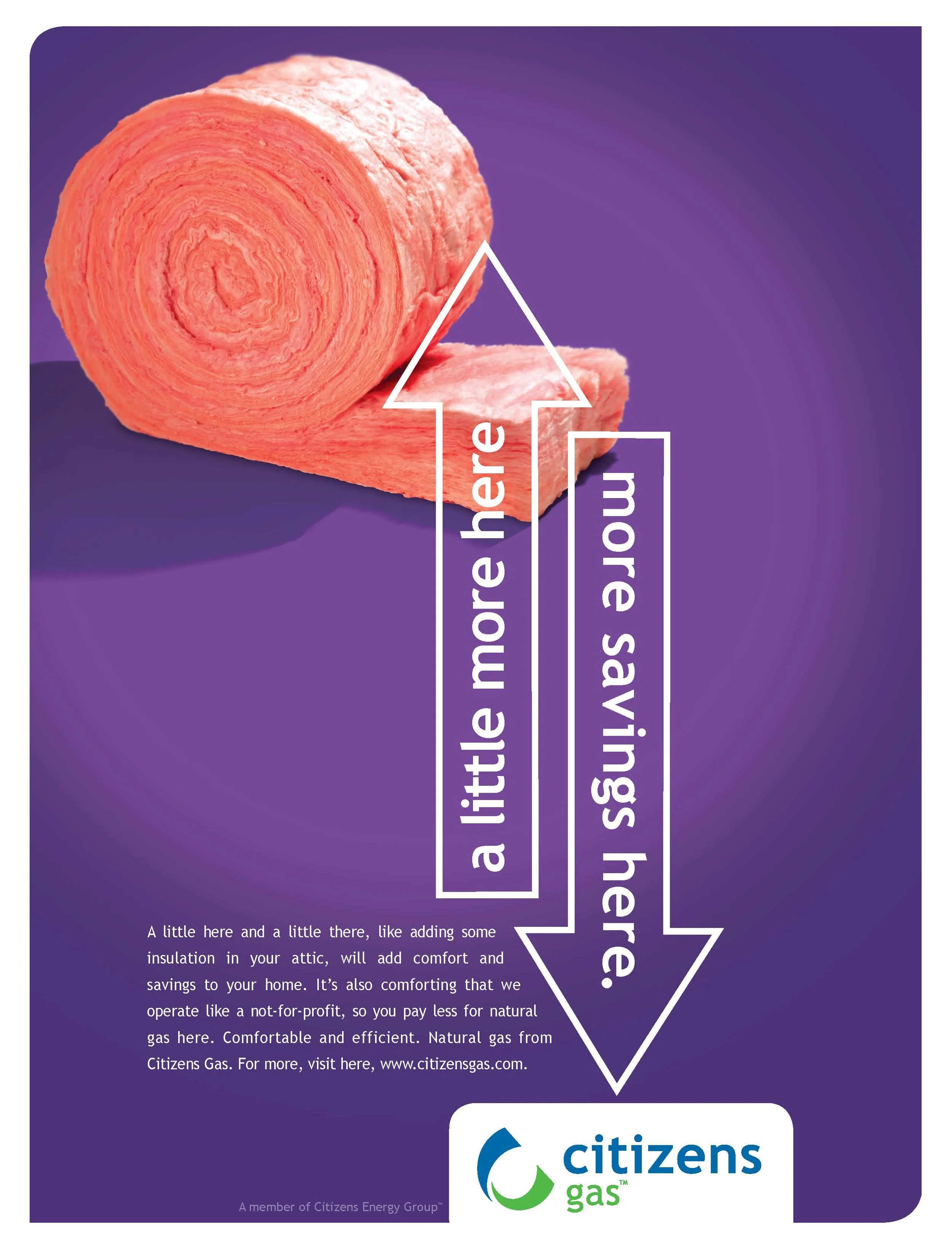
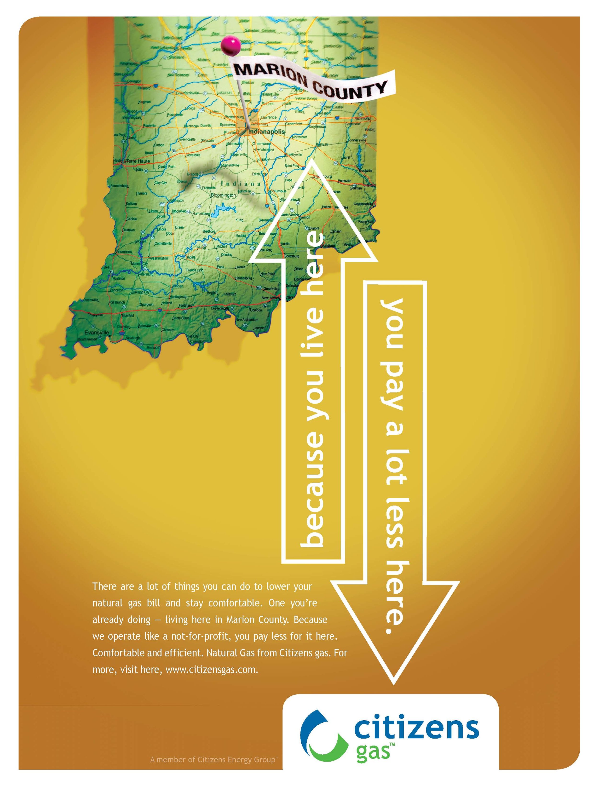
Citizens Energy Group wanted this campaign to highlight conservation, affordable gas prices, and their charitable trust status—something many people weren’t familiar with. So, we created the “Here” campaign: an upbeat, engaging series featuring lively music and motion-tracking graphics designed to guide viewers through simple, practical steps to help lower their utility bills.